T
y
l
b
y
N
a
t
w
e
s
t


I played a key role in establishing our brand identity and implementing design systems for coherence. Collaborating closely with service design, I ensured a seamless customer experience.
Additionally, I curated various materials to enhance brand presence and engagement. My hands-on approach extended across all design realms, ensuring meticulous attention to detail in every project.
My role
Head of Creative & UX
Leadership
Creative direction
Feature Scoping
Research
UX UI Design
Brand Design
Animation
Prototyping
Head of Creative & UX
Leadership
Feature Scoping
UX UI Design
Animation
Creative direction
Research
Brand Design
Prototyping
Timeline
13 months to launch
2.5 years of updates & improvements
INdustry
Fintech
Payments
Managed team size
13 Designers
3 Project managers
Project type
Zero to One
VIA CLIENTs
Class35
Pollinate International
Project vision
Design a friendly payment platform that simplifies complex financial tasks for medium to large businesses, giving merchants the tools and insights they need to thrive.
The Brand
Developing Tyl’s brand involved refining multiple concepts to a final name that symbolizes ease and connectivity.
The bespoke, hand-drawn logo merges Natwest’s consumer warmth with business sophistication, fusing sans-serif font with cursive ligatures for a modern, handwritten feel. I played a key role in crafting the logo and iterating through various designs and brand treatments until achieving the desired result.

Early sketches of the Tyl name were created. We experimented with different styles, including some "anti-design" directions (which were trendy at the time) and more traditional cursive looks.
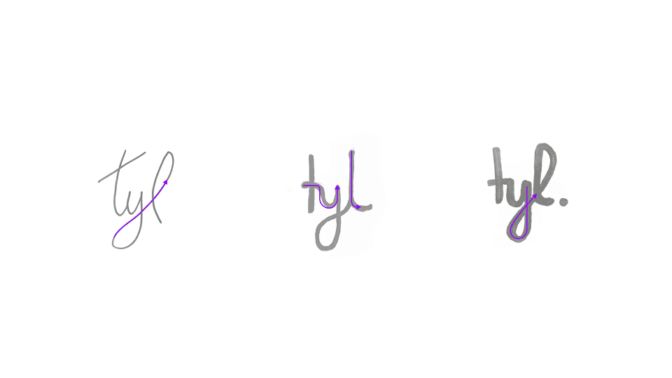
We knew early on in the design process that we wanted a more handwritten feel for the logo. We tried a few iterations on paper first and then combined what we liked digitally.

We went through a ton of different names and concepts initially. The name Tyl was actually discounted in the first round. The name grew on us later, and we decided to develop it further.

This is a fun image that is full of memories. It was done while on a call in a meeting room, speaking about something completely different. The other names were not working, and we were discussing (while on mute) how we could create the Tyl logo. I drew various sketches which then formed the foundation for the concept of the handwritten style.
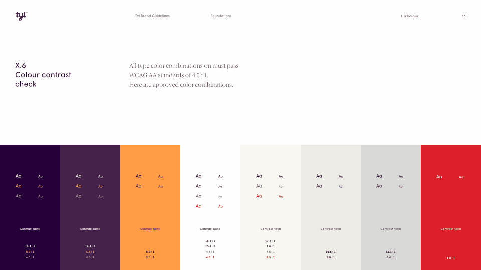
The Tyl brand was initially was supposed to be a stand alone brand, that was backed by Natwest. Rather than being a direct Natwest product. So it had a bit of a different feel. I think we went though around 3 or 4 actual rebrands in total during this project.

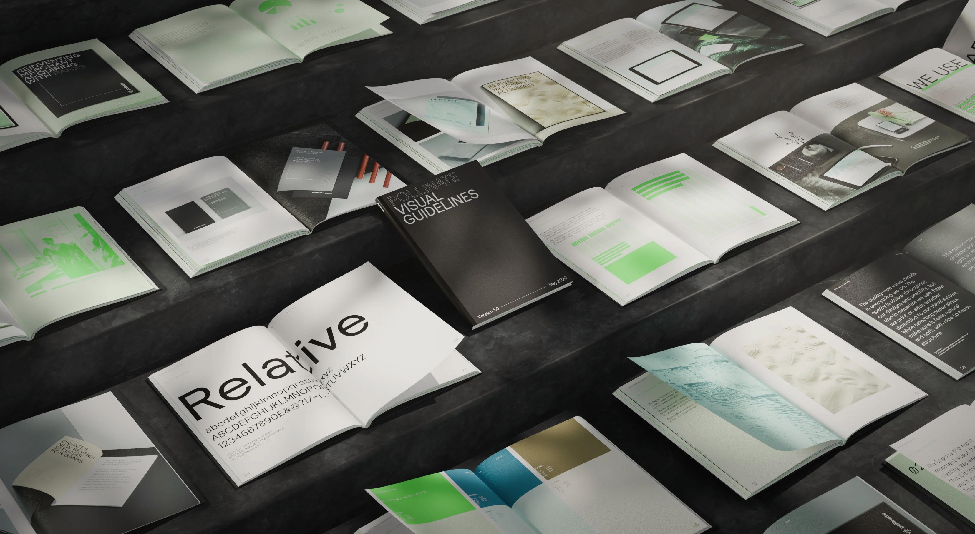
This is the final style guide that was created for Tyl by NatWest. It was very comprehensive and covered everything from visuals to tone of voice.

Early sketches of the Tyl name were created. We experimented with different styles, including some "anti-design" directions (which were trendy at the time) and more traditional cursive looks.

We knew early on in the design process that we wanted a more handwritten feel for the logo. We tried a few iterations on paper first and then combined what we liked digitally.

We went through a ton of different names and concepts initially. The name Tyl was actually discounted in the first round. The name grew on us later, and we decided to develop it further.

This is a fun image that is full of memories. It was done while on a call in a meeting room, speaking about something completely different. The other names were not working, and we were discussing (while on mute) how we could create the Tyl logo. I drew various sketches which then formed the foundation for the concept of the handwritten style.

The Tyl brand was initially was supposed to be a stand alone brand, that was backed by Natwest. Rather than being a direct Natwest product. So it had a bit of a different feel. I think we went though around 3 or 4 actual rebrands in total during this project.

This is the final style guide that was created for Tyl by NatWest. It was very comprehensive and covered everything from visuals to tone of voice.

Early sketches of the Tyl name were created. We experimented with different styles, including some "anti-design" directions (which were trendy at the time) and more traditional cursive looks.

We knew early on in the design process that we wanted a more handwritten feel for the logo. We tried a few iterations on paper first and then combined what we liked digitally.

We went through a ton of different names and concepts initially. The name Tyl was actually discounted in the first round. The name grew on us later, and we decided to develop it further.

This is a fun image that is full of memories. It was done while on a call in a meeting room, speaking about something completely different. The other names were not working, and we were discussing (while on mute) how we could create the Tyl logo. I drew various sketches which then formed the foundation for the concept of the handwritten style.

The Tyl brand was initially was supposed to be a stand alone brand, that was backed by Natwest. Rather than being a direct Natwest product. So it had a bit of a different feel. I think we went though around 3 or 4 actual rebrands in total during this project.

This is the final style guide that was created for Tyl by NatWest. It was very comprehensive and covered everything from visuals to tone of voice.

Early sketches of the Tyl name were created. We experimented with different styles, including some "anti-design" directions (which were trendy at the time) and more traditional cursive looks.

We knew early on in the design process that we wanted a more handwritten feel for the logo. We tried a few iterations on paper first and then combined what we liked digitally.

We went through a ton of different names and concepts initially. The name Tyl was actually discounted in the first round. The name grew on us later, and we decided to develop it further.

This is a fun image that is full of memories. It was done while on a call in a meeting room, speaking about something completely different. The other names were not working, and we were discussing (while on mute) how we could create the Tyl logo. I drew various sketches which then formed the foundation for the concept of the handwritten style.

The Tyl brand was initially was supposed to be a stand alone brand, that was backed by Natwest. Rather than being a direct Natwest product. So it had a bit of a different feel. I think we went though around 3 or 4 actual rebrands in total during this project.

This is the final style guide that was created for Tyl by NatWest. It was very comprehensive and covered everything from visuals to tone of voice.
Merchant Portal
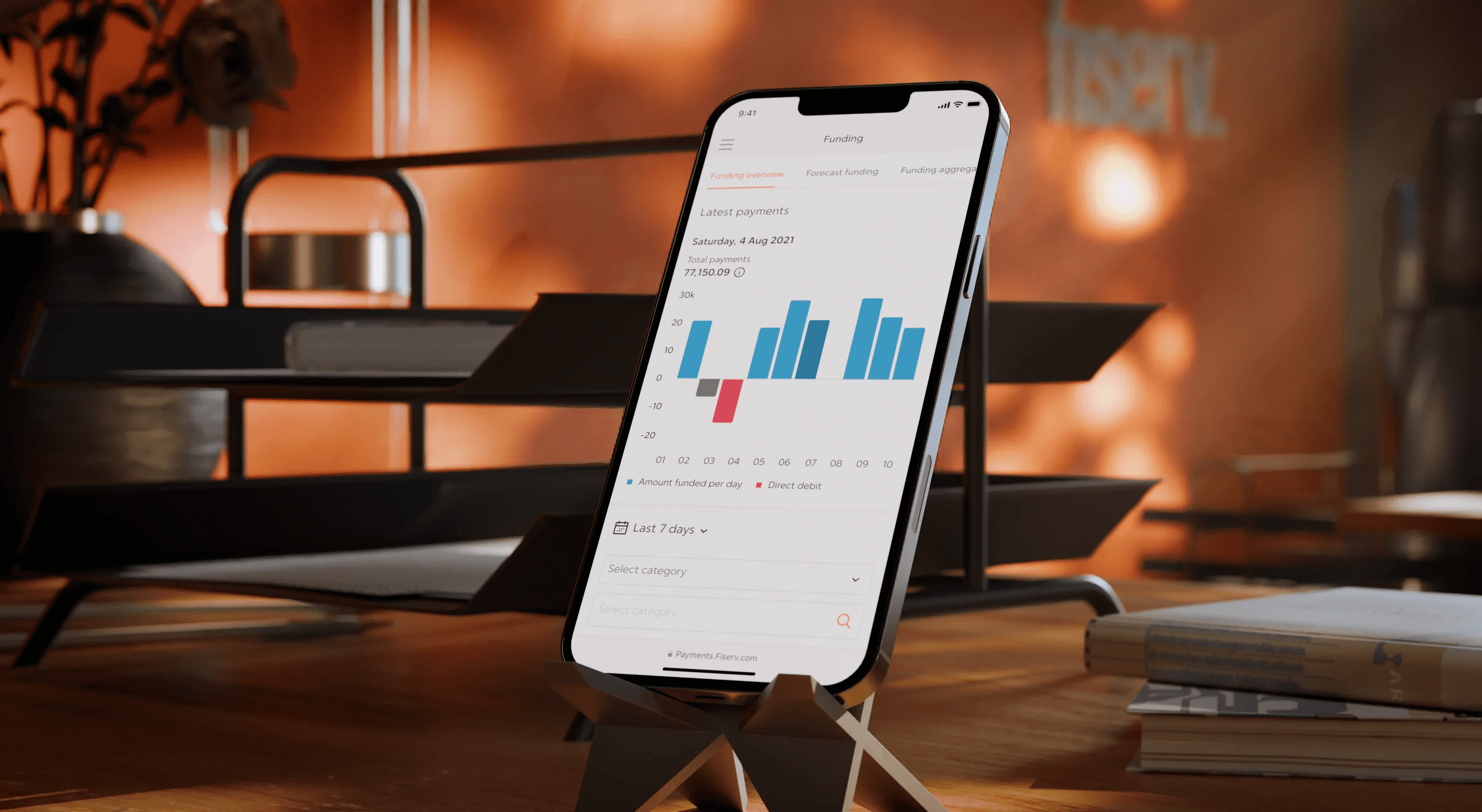
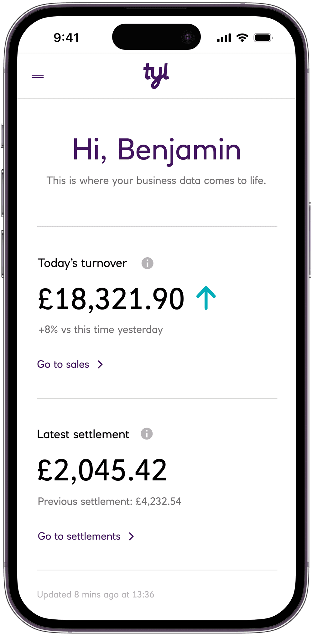
Working closely with my team, we developed a comprehensive interface offering insights, third-party integrations, and seamless chargeback handling. The design is fully responsive for both mobile and desktop.
INSIGHTS
Our focus on clarity and usability helped merchants quickly understand their business, increasing the user return rate by over 5x compared to industry competitors.




Payments
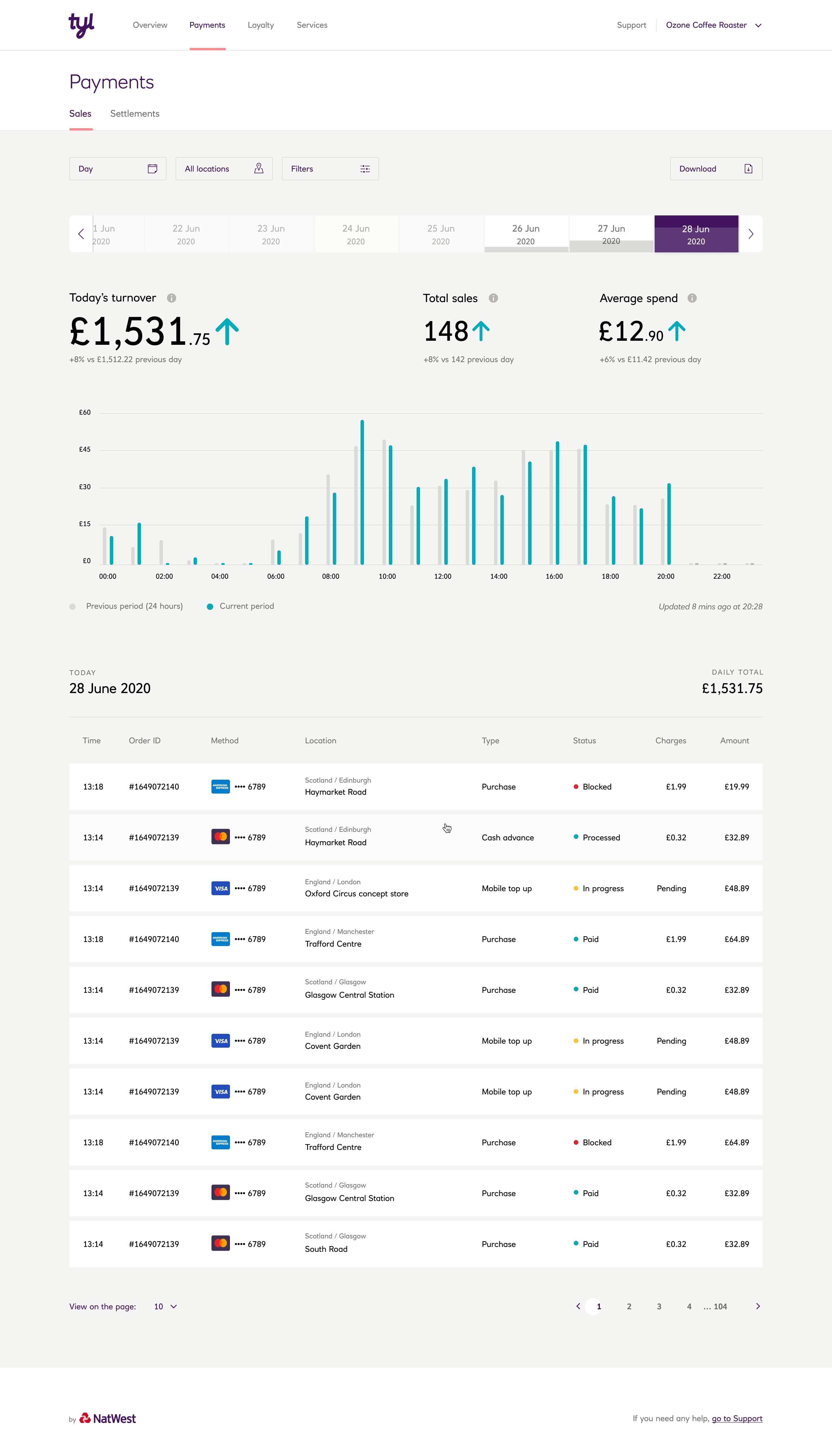
Designing these was especially challenging, as we wanted this process to be easy and functional for merchants. They can view individual transactions and grouped data effortlessly, and access Settlements to track how and when they get paid.


Other sections
We designed the Loyalty, Settings, Invoices, and Integrations pages to ensure seamless navigation and functionality. Each section supports merchants in efficiently managing all aspects of their business.
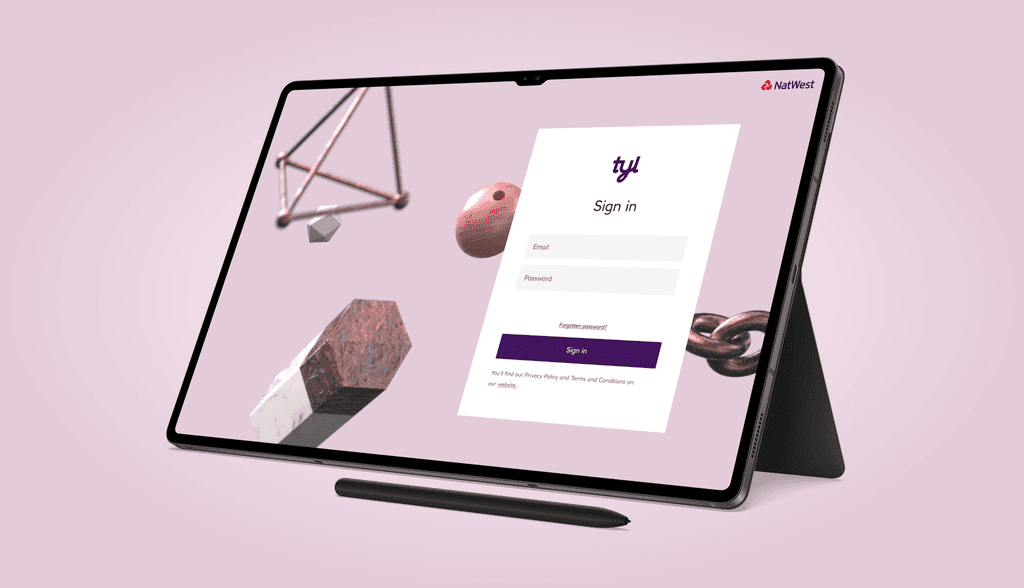
Early sketches of the Tyl name were created. We experimented with different styles, including some "anti-design" directions (which were trendy at the time) and more traditional cursive looks.
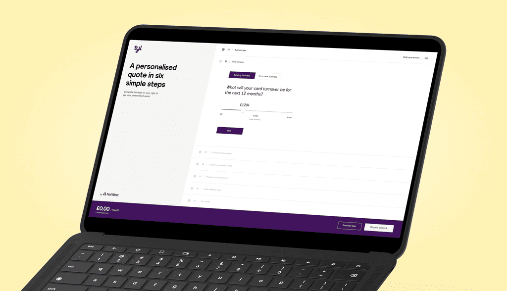
Digital onboarding - A first for this size of payments provider, especially for medium to large businesses.
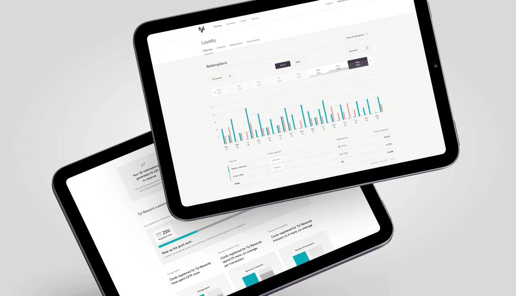
Loyalty section

Digital onboarding - A first for this size of payments provider, especially for medium to large businesses.

Early sketches of the Tyl name were created. We experimented with different styles, including some "anti-design" directions (which were trendy at the time) and more traditional cursive looks.

Digital onboarding - A first for this size of payments provider, especially for medium to large businesses.

Loyalty section

Digital onboarding - A first for this size of payments provider, especially for medium to large businesses.

Early sketches of the Tyl name were created. We experimented with different styles, including some "anti-design" directions (which were trendy at the time) and more traditional cursive looks.

Digital onboarding - A first for this size of payments provider, especially for medium to large businesses.

Loyalty section

Digital onboarding - A first for this size of payments provider, especially for medium to large businesses.

Early sketches of the Tyl name were created. We experimented with different styles, including some "anti-design" directions (which were trendy at the time) and more traditional cursive looks.

Digital onboarding - A first for this size of payments provider, especially for medium to large businesses.

Loyalty section

Digital onboarding - A first for this size of payments provider, especially for medium to large businesses.
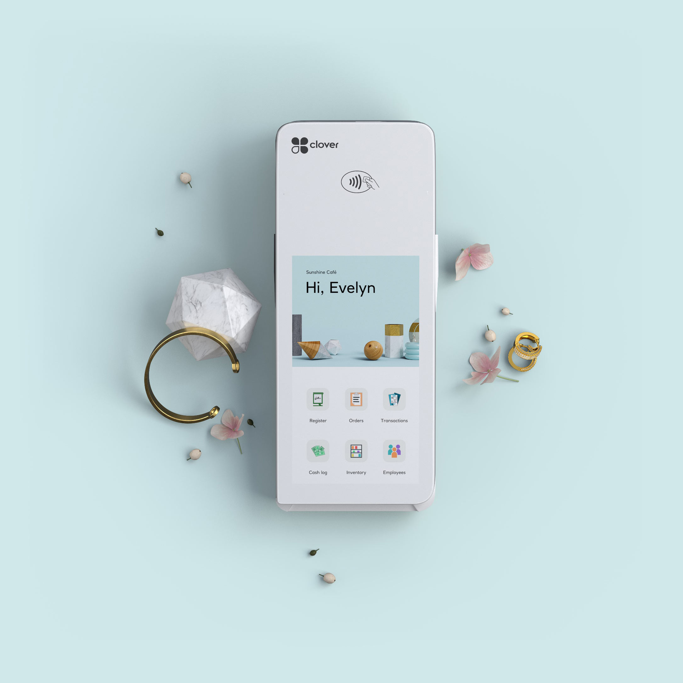


POS
We focused primarily on the Clover Smart POS device running on Android. We designed a custom loader and springboard interface featuring personalized startup displays, showing the user’s name to add a personal touch. Consistent branding was applied across all devices, ensuring a cohesive experience.
FUTURE ITERATIONS
Future iterations of the Clover POS aimed to provide merchants with insights and reminders based on milestones, enhancing their ability to manage and grow their business effectively.



Design system
We applied atomic design principles to develop Tyl by Natwest’s design system. Using Sketch and Abstract, we created a master library of components, ensuring consistency and efficiency across all platforms. I wish we used Figma, but it wasn’t as mature enough then, but our approach proved highly effective.
Atomic Design Principles
Atomic design breaks interfaces into basic blocks: atoms, molecules, organisms, templates, and pages. This method ensures a consistent, scalable design process, integrating the simplest elements into cohesive layouts.


3D Photography
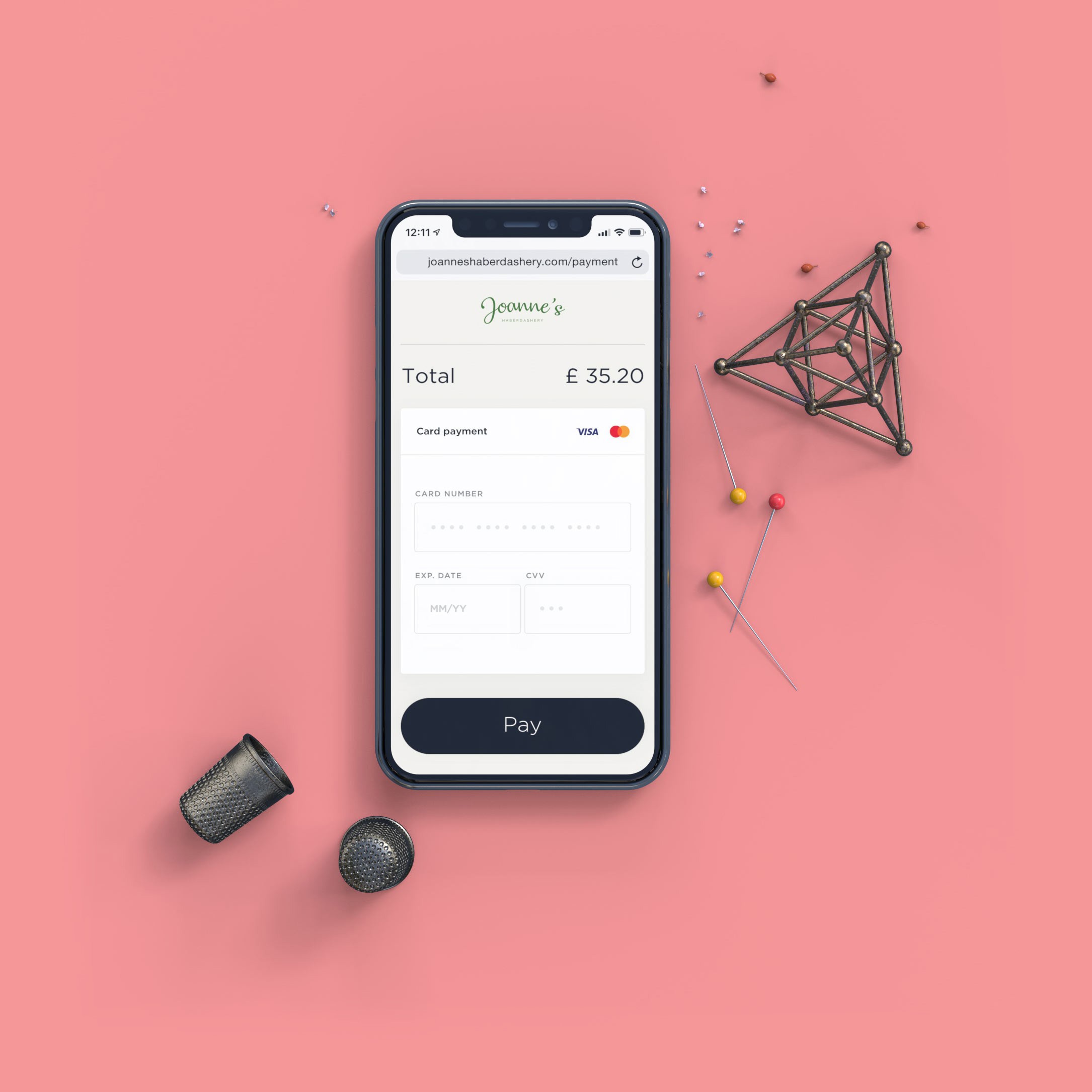
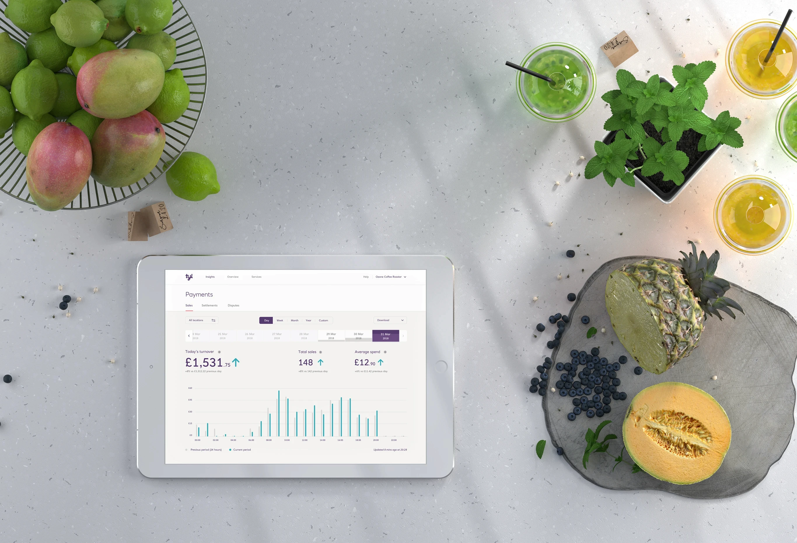
Seeing the rise of raytraced photorealistic renders with new GPU-based software like Octane Render and RedShift, I explored these tools to achieve near-real-time rendering. This shift to 3D photography provided flexibility, allowing us to create and update marketing assets without a studio. We meticulously remade all devices in 3D, achieving a photorealistic look and complete creative freedom.
BENEFITS
3D photography allowed quick updates and consistent visuals. We controlled lighting, materials, and composition, enhancing visual quality and saving time and costs compared to traditional photoshoots. This approach enabled rapid response to marketing needs and creative ideas.


Public website
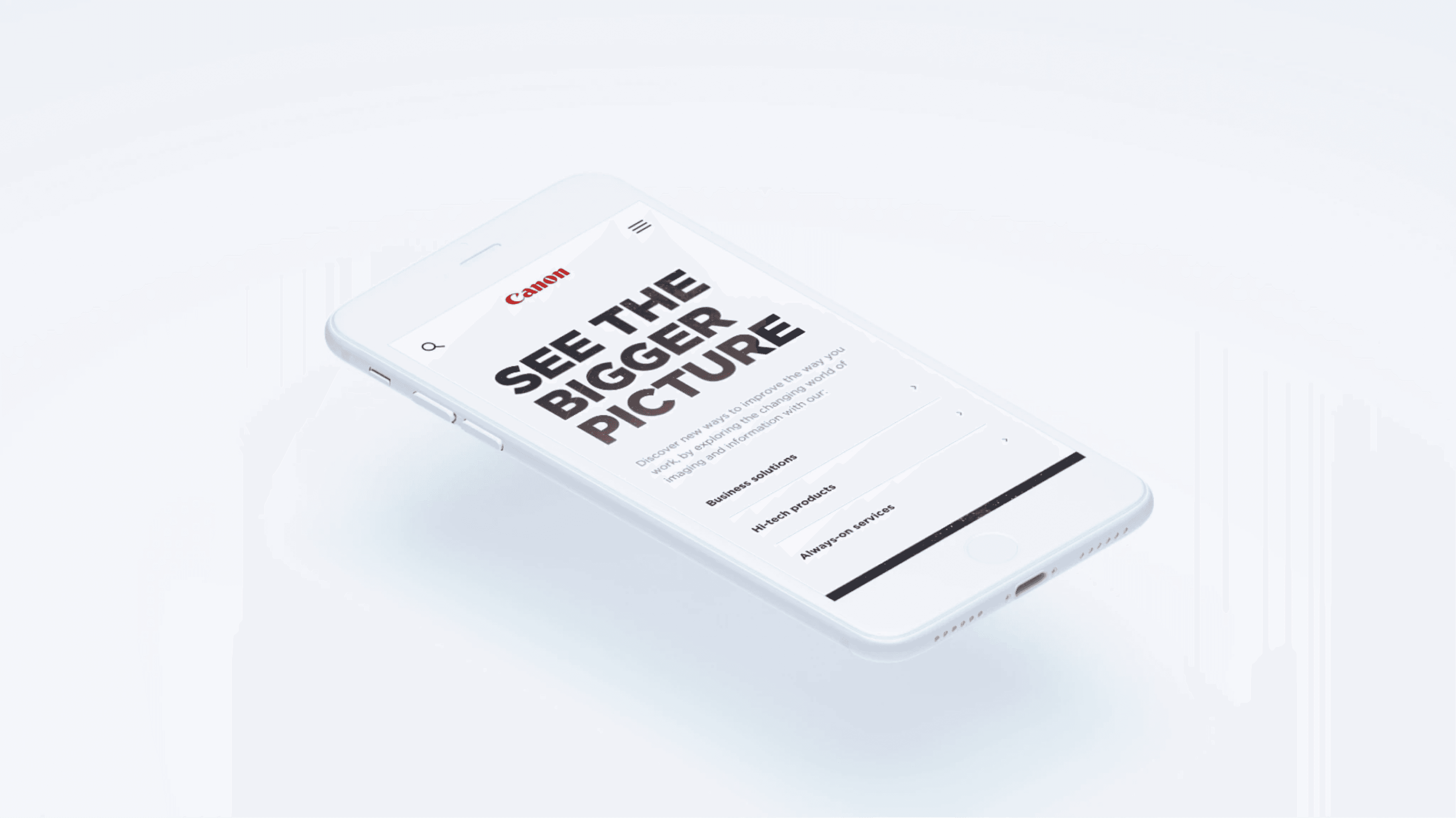
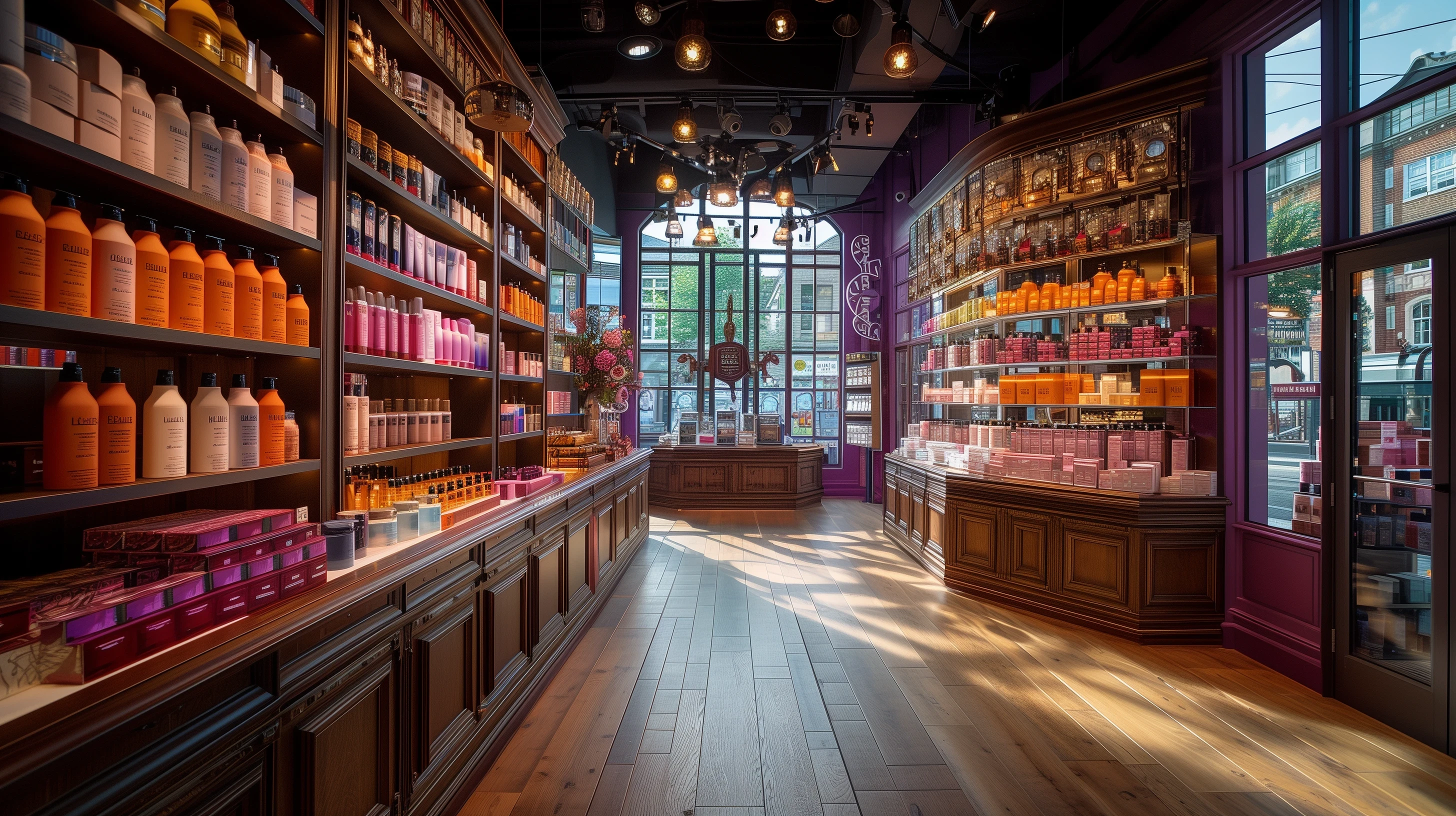
The public website leveraged all our previously created assets to craft a simple yet experiential online presence. We played with layering, depth, and 3D elements to create a visually engaging and dynamic experience for users.
PROTOTYPING
To ensure seamless interactions and a smooth user experience, we extensively prototyped the site using Principle. This allowed us to refine the interactions and animations, achieving a level of polish that pure code could not easily provide.
Best
Merchant Acquirer
Best
Merchant
Acquirer
Awarded in 2022, recognizing exceptional merchant services.
Zero to
Launch in
13 Months
Zero to
Launch in
13 Months
Rapid development and deployment of the full service.
Top
NPS
Score
Top
NPS
Score
Highest AMOUNG COMPETitors in the same sector
Outcomes
Our work on Tyl by Natwest resulted in significant achievements, marked by industry recognition and user satisfaction. We developed a comprehensive, user-friendly interface that integrates insights, third-party tools, and chargeback management, all while maintaining full responsiveness for both mobile and desktop platforms.
Recognition
Tyl's success was recognized with several accolades, including the Best Merchant Acquirer award in 2022. It also achieved the highest NPS score among competitors, highlighting its exceptional user experience and merchant satisfaction.
Credits
This project was a collaborative effort involving numerous talented individuals across various stages and areas of the business.
Many team members contributed significantly, whether they worked briefly on a specific task or were involved in the early stages.
Their efforts were crucial to the success of Tyl by Natwest.
The design team
Christer Papanicolaou,
Christer Papanicolaou,
Head of creative & user experience
Janos Koos,
Janos Koos,
Design director
Ned Bertram,
Ned Bertram,
UX Director
Gosia Zalot,
Gosia Zalot,
Design director
Pontus Persson,
Pontus Persson,
Senior UX Designer
Kevin Johnston,
Kevin Johnston,
SENIOR VISUAL DESIGNER
Ben Richardson,
Ben Richardson,
SENIOR VISUAL DESIGNER
Igor Dutra,
Igor Dutra,
SENIOR UX DESIGNER
Beuno David,
Beuno David,
SENIOR VISUAL DESIGNER
Ben Bashford,
Ben Bashford,
UX Director
Julien Pietri,
Julien Pietri,
3D Artist
Michael Chapman
Michael Chapman
SENIOR VISUAL DESIGNER
and others.
and others.
lots of talented people
honorable mentions
Fiona Roach Canning,
Fiona Roach Canning,
CEO of Pollinate
Tim Joslyn,
Tim Joslyn,
CTO of Pollinate
Nick Parminter,
Nick Parminter,
HEAD OF STRATEGY
Mark Hazzard,
Mark Hazzard,
Head of Delivery
Bob Conwell,
Bob Conwell,
HEAD OF PRODUCT
Kim Murray,
Kim Murray,
Programme director
Rakesh Jena,
Rakesh Jena,
Product owner
Billy Asif,
Billy Asif,
Product owner
Gemma Asher,
Gemma Asher,
Project manager
Deep Dhir,
Deep Dhir,
Project manager
Gianni di Raimondo,
Gianni di Raimondo,
Product owner
Adam Clarke,
Adam Clarke,
Product owner
and others.
and others.
lots of talented people
T
y
l
b
y
N
a
t
w
e
s
t


I played a key role in establishing our brand identity and implementing design systems for coherence. Collaborating closely with service design, I ensured a seamless customer experience.
Additionally, I curated various materials to enhance brand presence and engagement. My hands-on approach extended across all design realms, ensuring meticulous attention to detail in every project.
My role
Head of Creative & UX
Leadership
Creative direction
Feature Scoping
Research
UX UI Design
Brand Design
Animation
Prototyping
Head of Creative & UX
Leadership
Feature Scoping
UX UI Design
Animation
Creative direction
Research
Brand Design
Prototyping
Timeline
13 months to launch
2.5 years of updates & improvements
INdustry
Fintech
Payments
Managed team size
13 Designers
3 Project managers
Project type
Zero to One
VIA CLIENTs
Class35
Pollinate International

Project vision
Design a friendly payment platform that simplifies complex financial tasks for medium to large businesses, giving merchants the tools and insights they need to thrive.
The Brand
Developing Tyl’s brand involved refining multiple concepts to a final name that symbolizes ease and connectivity.
The bespoke, hand-drawn logo merges Natwest’s consumer warmth with business sophistication, fusing sans-serif font with cursive ligatures for a modern, handwritten feel. I played a key role in crafting the logo and iterating through various designs and brand treatments until achieving the desired result.

Early sketches of the Tyl name were created. We experimented with different styles, including some "anti-design" directions (which were trendy at the time) and more traditional cursive looks.

We knew early on in the design process that we wanted a more handwritten feel for the logo. We tried a few iterations on paper first and then combined what we liked digitally.

We went through a ton of different names and concepts initially. The name Tyl was actually discounted in the first round. The name grew on us later, and we decided to develop it further.

This is a fun image that is full of memories. It was done while on a call in a meeting room, speaking about something completely different. The other names were not working, and we were discussing (while on mute) how we could create the Tyl logo. I drew various sketches which then formed the foundation for the concept of the handwritten style.

The Tyl brand was initially was supposed to be a stand alone brand, that was backed by Natwest. Rather than being a direct Natwest product. So it had a bit of a different feel. I think we went though around 3 or 4 actual rebrands in total during this project.

This is the final style guide that was created for Tyl by NatWest. It was very comprehensive and covered everything from visuals to tone of voice.

Early sketches of the Tyl name were created. We experimented with different styles, including some "anti-design" directions (which were trendy at the time) and more traditional cursive looks.

We knew early on in the design process that we wanted a more handwritten feel for the logo. We tried a few iterations on paper first and then combined what we liked digitally.

We went through a ton of different names and concepts initially. The name Tyl was actually discounted in the first round. The name grew on us later, and we decided to develop it further.

This is a fun image that is full of memories. It was done while on a call in a meeting room, speaking about something completely different. The other names were not working, and we were discussing (while on mute) how we could create the Tyl logo. I drew various sketches which then formed the foundation for the concept of the handwritten style.

The Tyl brand was initially was supposed to be a stand alone brand, that was backed by Natwest. Rather than being a direct Natwest product. So it had a bit of a different feel. I think we went though around 3 or 4 actual rebrands in total during this project.

This is the final style guide that was created for Tyl by NatWest. It was very comprehensive and covered everything from visuals to tone of voice.

Early sketches of the Tyl name were created. We experimented with different styles, including some "anti-design" directions (which were trendy at the time) and more traditional cursive looks.

We knew early on in the design process that we wanted a more handwritten feel for the logo. We tried a few iterations on paper first and then combined what we liked digitally.

We went through a ton of different names and concepts initially. The name Tyl was actually discounted in the first round. The name grew on us later, and we decided to develop it further.

This is a fun image that is full of memories. It was done while on a call in a meeting room, speaking about something completely different. The other names were not working, and we were discussing (while on mute) how we could create the Tyl logo. I drew various sketches which then formed the foundation for the concept of the handwritten style.

The Tyl brand was initially was supposed to be a stand alone brand, that was backed by Natwest. Rather than being a direct Natwest product. So it had a bit of a different feel. I think we went though around 3 or 4 actual rebrands in total during this project.

This is the final style guide that was created for Tyl by NatWest. It was very comprehensive and covered everything from visuals to tone of voice.

Early sketches of the Tyl name were created. We experimented with different styles, including some "anti-design" directions (which were trendy at the time) and more traditional cursive looks.

We knew early on in the design process that we wanted a more handwritten feel for the logo. We tried a few iterations on paper first and then combined what we liked digitally.

We went through a ton of different names and concepts initially. The name Tyl was actually discounted in the first round. The name grew on us later, and we decided to develop it further.

This is a fun image that is full of memories. It was done while on a call in a meeting room, speaking about something completely different. The other names were not working, and we were discussing (while on mute) how we could create the Tyl logo. I drew various sketches which then formed the foundation for the concept of the handwritten style.

The Tyl brand was initially was supposed to be a stand alone brand, that was backed by Natwest. Rather than being a direct Natwest product. So it had a bit of a different feel. I think we went though around 3 or 4 actual rebrands in total during this project.

This is the final style guide that was created for Tyl by NatWest. It was very comprehensive and covered everything from visuals to tone of voice.
Merchant Portal
Working closely with my team, we developed a comprehensive interface offering insights, third-party integrations, and seamless chargeback handling. The design is fully responsive for both mobile and desktop.
INSIGHTS
Our focus on clarity and usability helped merchants quickly understand their business, increasing the user return rate by over 5x compared to industry competitors.


Payments
Designing these was especially challenging, as we wanted this process to be easy and functional for merchants. They can view individual transactions and grouped data effortlessly, and access Settlements to track how and when they get paid.


Other sections
We designed the Loyalty, Settings, Invoices, and Integrations pages to ensure seamless navigation and functionality. Each section supports merchants in efficiently managing all aspects of their business.

Early sketches of the Tyl name were created. We experimented with different styles, including some "anti-design" directions (which were trendy at the time) and more traditional cursive looks.

Digital onboarding - A first for this size of payments provider, especially for medium to large businesses.

Loyalty section

Digital onboarding - A first for this size of payments provider, especially for medium to large businesses.

Early sketches of the Tyl name were created. We experimented with different styles, including some "anti-design" directions (which were trendy at the time) and more traditional cursive looks.

Digital onboarding - A first for this size of payments provider, especially for medium to large businesses.

Loyalty section

Digital onboarding - A first for this size of payments provider, especially for medium to large businesses.

Early sketches of the Tyl name were created. We experimented with different styles, including some "anti-design" directions (which were trendy at the time) and more traditional cursive looks.

Digital onboarding - A first for this size of payments provider, especially for medium to large businesses.

Loyalty section

Digital onboarding - A first for this size of payments provider, especially for medium to large businesses.

Early sketches of the Tyl name were created. We experimented with different styles, including some "anti-design" directions (which were trendy at the time) and more traditional cursive looks.

Digital onboarding - A first for this size of payments provider, especially for medium to large businesses.

Loyalty section

Digital onboarding - A first for this size of payments provider, especially for medium to large businesses.


POS
We focused primarily on the Clover Smart POS device running on Android. We designed a custom loader and springboard interface featuring personalized startup displays, showing the user’s name to add a personal touch. Consistent branding was applied across all devices, ensuring a cohesive experience.
FUTURE ITERATIONS
Future iterations of the Clover POS aimed to provide merchants with insights and reminders based on milestones, enhancing their ability to manage and grow their business effectively.


Design system
We applied atomic design principles to develop Tyl by Natwest’s design system. Using Sketch and Abstract, we created a master library of components, ensuring consistency and efficiency across all platforms. I wish we used Figma, but it wasn’t as mature enough then, but our approach proved highly effective.
Atomic Design Principles
Atomic design breaks interfaces into basic blocks: atoms, molecules, organisms, templates, and pages. This method ensures a consistent, scalable design process, integrating the simplest elements into cohesive layouts.


3D Photography
Seeing the rise of raytraced photorealistic renders with new GPU-based software like Octane Render and RedShift, I explored these tools to achieve near-real-time rendering. This shift to 3D photography provided flexibility, allowing us to create and update marketing assets without a studio. We meticulously remade all devices in 3D, achieving a photorealistic look and complete creative freedom.
BENEFITS
3D photography allowed quick updates and consistent visuals. We controlled lighting, materials, and composition, enhancing visual quality and saving time and costs compared to traditional photoshoots. This approach enabled rapid response to marketing needs and creative ideas.


Public website
The public website leveraged all our previously created assets to craft a simple yet experiential online presence. We played with layering, depth, and 3D elements to create a visually engaging and dynamic experience for users.
PROTOTYPING
To ensure seamless interactions and a smooth user experience, we extensively prototyped the site using Principle. This allowed us to refine the interactions and animations, achieving a level of polish that pure code could not easily provide.
Best
Merchant
Acquirer
Awarded in 2022, recognizing exceptional merchant services.
Zero to
Launch in
13 Months
Rapid development and deployment of the full service.
Top
NPS
Score
Highest AMOUNG COMPETitors in the same sector
Outcomes
Our work on Tyl by Natwest resulted in significant achievements, marked by industry recognition and user satisfaction. We developed a comprehensive, user-friendly interface that integrates insights, third-party tools, and chargeback management, all while maintaining full responsiveness for both mobile and desktop platforms.
Recognition
Tyl's success was recognized with several accolades, including the Best Merchant Acquirer award in 2022. It also achieved the highest NPS score among competitors, highlighting its exceptional user experience and merchant satisfaction.
Credits
This project was a collaborative effort involving numerous talented individuals across various stages and areas of the business.
Many team members contributed significantly, whether they worked briefly on a specific task or were involved in the early stages.
Their efforts were crucial to the success of Tyl by Natwest.
The design team
Christer Papanicolaou,
Christer Papanicolaou,
Head of creative & user experience
Janos Koos,
Janos Koos,
Design director
Ned Bertram,
Ned Bertram,
UX Director
Gosia Zalot,
Gosia Zalot,
Design director
Pontus Persson,
Pontus Persson,
Senior UX Designer
Kevin Johnston,
Kevin Johnston,
SENIOR VISUAL DESIGNER
Ben Richardson,
Ben Richardson,
SENIOR VISUAL DESIGNER
Igor Dutra,
Igor Dutra,
SENIOR UX DESIGNER
Beuno David,
Beuno David,
SENIOR VISUAL DESIGNER
Ben Bashford,
Ben Bashford,
UX Director
Julien Pietri,
Julien Pietri,
3D Artist
Michael Chapman
Michael Chapman
SENIOR VISUAL DESIGNER
and others.
and others.
lots of talented people
honorable mentions
Fiona Roach Canning,
Fiona Roach Canning,
CEO of Pollinate
Tim Joslyn,
Tim Joslyn,
CTO of Pollinate
Nick Parminter,
Nick Parminter,
HEAD OF STRATEGY
Mark Hazzard,
Mark Hazzard,
Head of Delivery
Bob Conwell,
Bob Conwell,
HEAD OF PRODUCT
Kim Murray,
Kim Murray,
Programme director
Rakesh Jena,
Rakesh Jena,
Product owner
Billy Asif,
Billy Asif,
Product owner
Gemma Asher,
Gemma Asher,
Project manager
Deep Dhir,
Deep Dhir,
Project manager
Gianni di Raimondo,
Gianni di Raimondo,
Product owner
Adam Clarke,
Adam Clarke,
Product owner
and others.
and others.
lots of talented people
